BRANDING / PACKAGE DESIGN
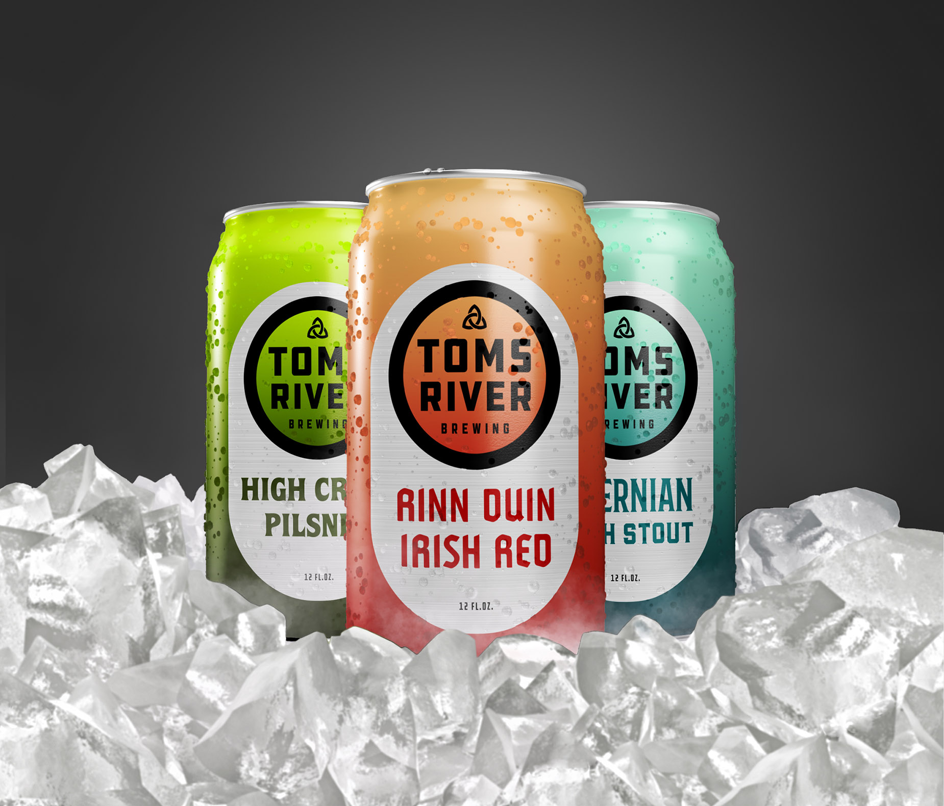
Toms River Brewing wanted to redesign their brand identity and packaging. The objective was to appeal to a younger crowd without relying on trendy hipster tropes while still retaining reference to the Irish heritage that was shared by the owner, brewer and investor, and was the foundation of their brand. Because TRB will compete with more well-known brands in the crowded bars of the Jersey Shore. We decided the logo should be highly legible and easily recognizable on a tap handle. And because visibility was the name of the game, we carried that minimalism into the package design, creating an iconic layout that relies on varied typography and color gradients to distinguish beer styles. Gradient fields are also reserved for artwork & patterns to be added on limited run brews.


