Author: Adam Bezer

  • spice

    spice

    BRANDING / TYPE DESIGN / ILLUSTRATION

    Matthew and Jarret named their patented plant-based collagen supplement after a fictional drug in the sci-fi classic Dune. So when they asked for a logo that reflected its sci-fi origins, I said, “That sounds super weird– let’s do it.” Using Klavika and other typography like the NASA “worm” logo as references, I created a distinctive, nearly-symmetrical wordmark that walks the line between science fiction and the clean, trustworthy fonts vernacular to medical consumer goods.


    spice.logo
    spice.tn
    mockups-design.com
    bcard
    spice-stationary
    spice_booklet
    spice-type
  • Toms River Brewing

    Toms River Brewing

    BRANDING / PACKAGE DESIGN

    Toms River Brewing wanted to redesign their brand identity and packaging. The objective was to appeal to a younger crowd without relying on trendy hipster tropes while still retaining reference to the Irish heritage that was shared by the owner, brewer and investor, and was the foundation of their brand. Because TRB will compete with more well-known brands in the crowded bars of the Jersey Shore. We decided the logo should be highly legible and easily recognizable on a tap handle. And because visibility was the name of the game, we carried that minimalism into the package design, creating an iconic layout that relies on varied typography and color gradients to distinguish beer styles. Gradient fields are also reserved for artwork & patterns to be added on limited run brews.


    green-275-x2
    red-275-x2
    blue-275-x1
    14738936 - aluminum cans isolated on white
    14738936 - aluminum cans isolated on white
    14738936 - aluminum cans isolated on white
    Cool can frozen mockup
    Logo Mockup Collection by Asylab
    toms-river-coaster-1
    beer-tap-2400
    trb-van
    trb-typography
  • Revelry on the River

    Revelry on the River

    Print Design / Campaign / Architectural Rendering

    “We change the way people think about energy.” The annual fundraising event, Revelry on the River, was used to garner interest in a proposed building to be New York City’s first fully sustainable, net-zero architecture. Materials designed included invitations and associated printed material, infographics regarding the proposed building, as well as architectural renderings based off the original CAD drawings of the building.


    revelry-invitation
    mosaic-revelry
    confetti.card
    insert-card
    Solar.2_Render.wide
    S2.Floor-Plan
    tesla_S2
    s2-ferry
  • Green Design Lab

    Green Design Lab

    WEB DESIGN / BRANDING / VIDEOGRAPHY

    Green Design Lab is a K–12 science education program focused on STEM skills, renewable energy and sustainable design. This was a years-long project which encompassed branding, print design, web design, and video. Below is a small selection of work.

    To view the full site click here.


    WEBSITE: The GDL program was a traditional in-person educational presentation until I built a content-rich and resource heavy membership-based site which included video tutorials, curriculum guides and reference materials. The site launched GDL into a whole new business model and still serves as one of the best science education resources for NYC’s educators.


    Adam Bezer Solar One

    VIDEO: Selected by the National Science Foundation’s 2016 Video Showcase for the Facilitators’ Choice Award, the video stood out despite a shoestring budget and a three week deadline to plan, shoot and edit. For a one-man job, it was a great experience and a successful piece of communication design that conveys the depth of the company’s mission.


    CURRICULUM: The CleanTech Curriculum is over 700 pages of science education in STEM skills. Because the content was so varied and diverse, I set a narrow left column to place captions, footnotes, images, hyperlinks and more. This was very successful in practice and allowed the layout to be modular and able to accommodate all content while providing some much needed white space. I also created many of the illustrations.


    energy-cover
    energy-3
    energy-2
    energy-1
    materials-cover
    materials-2
    materials-1
    materials-3
    food-cover
    food-p3
    food-p1
    food-p2
    Cover-mockup
    water-p1
    water-p2
    water-p3
    Web
    Web
    decentralized-grid
    kelvin
  • meta/RE

    meta/RE

    BRANDING / PACKAGE DESIGN

    One of the many companies I worked with in the Columbia University PowerBridge Accelerator. meta/RE is a company focused on sustainable design using chemical engineering and nanotechnology. Through biomimicry, their products, such as paint and fabric, are able to efficiently reflect sunlight. This allows buildings and industrial equipment to remain cool throughout high temperature weather, shedding harmful sunlight radiation in order to greatly reduce cooling costs and increase the lifespan of outdoor machinery.


    meta-re-logo
    meta-RE-paint-cans
    paint-can-pour
    meta-RE-brochure copy
    radiative-cooling
    roof-painting
    fabric-swatch-2
    fabric-swatch
  • Solar1.org

    Solar1.org

    Web Design

    Solar One is a nonprofit arts and education company focused on renewable energy and sustainable design. They were in dire need of an overhaul of their website. After several weeks of concept development and wireframe sketches, I designed Solar1.org with the organization’s specific needs in mind. As a nonprofit that plays many roles, explaining Solar One’s services and programs concisely required a great deal of fat-trimming from the previous website. But after meticulous image selections, sentences written by consensus, and discussions of hierarchy, the site stands as a strong example of well-formulated information architecture. And of course, it’s fully mobile responsive.


  • Patrick Kosiewicz

    Patrick Kosiewicz

    Print Design

    “Heavily muscled myth and scorching reality collide to explosive effect in Patrick Kosiewicz’s How Many Suns Burn Over Babel Where Poets Die. This is a fierce, no, ferocious book. If I were you, I would immediately read it.”

    For Patrick Kosiewicz’s book about the American invasion of Afghanistan, I chose to juxtapose a heavy, military display typeface against a soft, Humanist typeface with ligatures to connote armored vehicles towering over a crowd of people. The cover, a dried-blood red. A traditional Islamic pattern fills the endpapers. Buy it here.


    babel-cover-peek
    spine-tilt
    babel-front-cover
    babel-cover-open
    babel_frontis
    ch-01
    ch-02
    ch-03
    title-pg
    text-macro
    ch-22
  • The Yard Coworking Space

    The Yard Coworking Space

    Advertising Campaign / COPYWRITING

    When the Director of Operations at The Yard asked me to pitch an ad campaign, he wanted to stand out from all the other coworking spaces by avoiding images of cliché networking events. Instead, he wanted to convey the idea that The Yard is a place to work hard, to grow your business, and to gain inspiration through focus.


    Yard-row
    close-2400
    jobs-2400
    ford-2400
  • Occupy Wall Street

    Occupy Wall Street

    Print Design / Branding / Illustration

    As a founding member of the Occupy Wall Street Design Work Group, I quickly became a workhorse. We were OWS’s official graphic design team, providing other working groups with printed and digital material. Below is a selection of works used during the Occupy Movement, including posters exhibited at The New York Public Library, The Bienal de São Paulo, Brazil, ar/ge kunst Galerie Museum in Bolzano, Italy, and at least one internal NYPD crowd control memorandum.
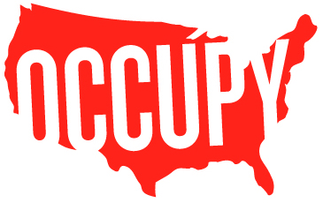
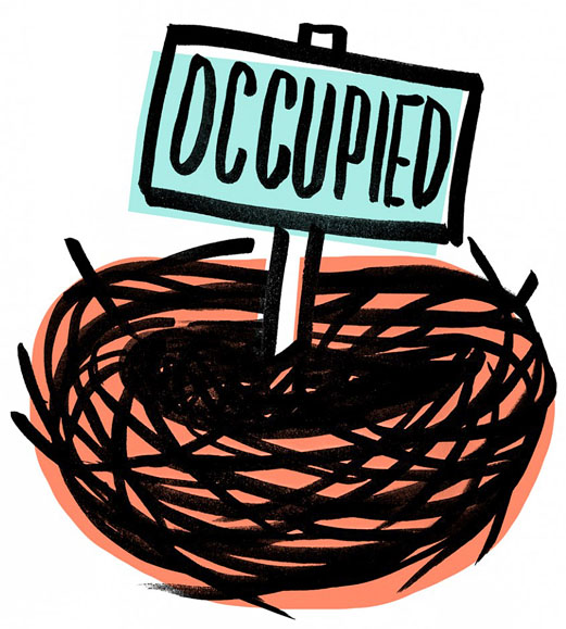


    Poster design

    A poster design which was later adapted for a postcard flyer for the May Day protests.

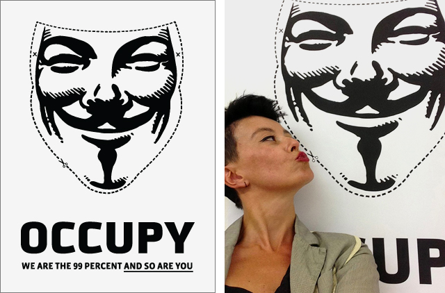
    My poster hanging on the walls of a gallery at The Biennial de São Paulo, Brazil. Shown in three exhibitions, my success with this rather basic design was simply recognizing that of the dozens of OWS posters, all were done by illustrators rather than graphic designers. I threw together this direct and graphic poster in 15 minutes. Originally to be distributed on 11×17 paper to be cut out and used as a mask, it was later featured in The Occupied Wall Street Journal’s Poster Edition.

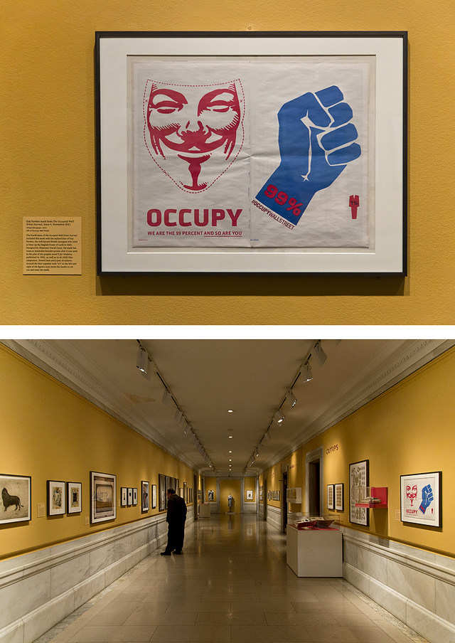
    My poster, as printed in the Occupied Wall Street Journal, hanging on the walls of the New York Public Library.

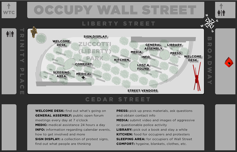
    This map was to be printed and distributed the week the park was raided.

    wayfinding

    Wayfinding signage also to be deployed the week of the raid.

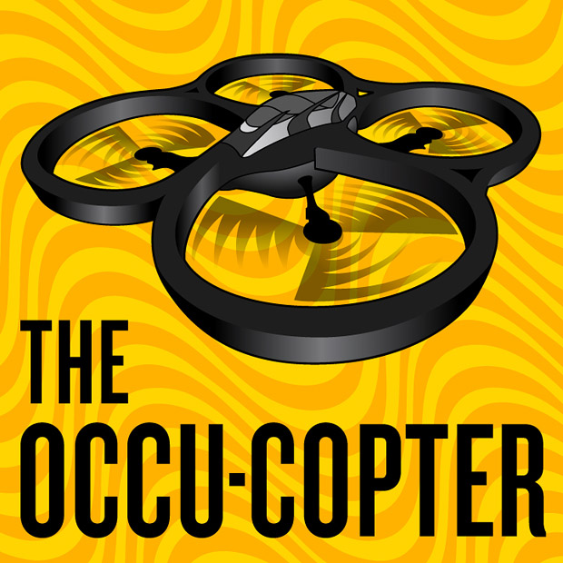
    An innovative concept to use drones for activists to monitor police activity. The client’s only request was a psychedelic background. The Adam West era Batmobile served as my inspiration for the illustration.

    Adam Bezer Occupy Wall Street

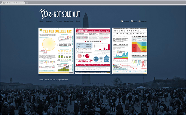
    WeGotSoldOut.org: A website I designed devoted to providing boilerplate 1-page infographic flyers to be freely downloaded and distributed at rallies.

    Adam Bezer Occupy Wall Street

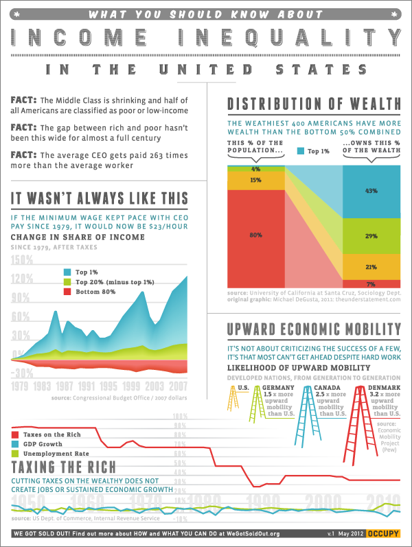
    An infographic flyer from the website

    Adam Bezer Occupy Wall Street

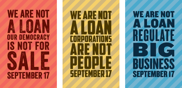
    Poster designs for the first anniversary of Occupy Wall Street.

    Adam Bezer Occupy Wall Street

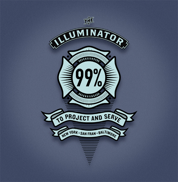
    The now-infamous Illuminator, pioneer of light projection activism, needed a t-shirt design for some kind of union event or something… I forget the details to be honest.

    Adam Bezer Occupy Wall Street

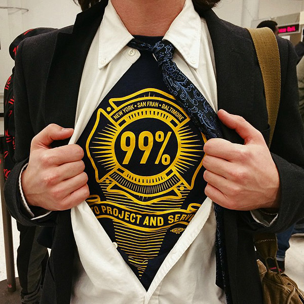
    And the design the client used. This image, taken outside a courtroom, was sent to me after the Illuminator crew was handed a verdict of not guilty!

    Adam Bezer Occupy Wall Street

    May Day poster design

    Adam Bezer Occupy Wall Street

    T-shirt design

    Adam Bezer Occupy Wall Street

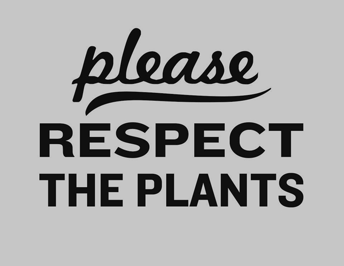
    As requested by Occupiers in Liberty Park.
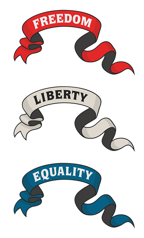
    Adam Bezer Occupy Wall Street

    ‘Merica

    Adam Bezer Occupy Wall Street

  • Here Comes Solar

    Here Comes Solar

    Branding/ Web Design / Illustration

    Affordable financing is a major goal in the consumer-side solar energy market. A solar array can last 25 years, easily recouping its price. But installation can cost a fortune. HCS’s savvy advisors help users navigate state sponsored financial incentives, building codes & regulations, and use collective bargaining to enabling building owners and solar installers to collaborate on financially viable funding strategies. The Here Comes Solar website provides a platform for buyers and installers to connect, learn and bargain. The site is a fully responsive, mobile-friendly interactive platform that is on the pioneering edge of solar energy proliferation.


    HCS.screencap.970
    HCS-icons-x970
  • Falling Short of Knowing

    Falling Short of Knowing

    Print Design / Web Design

    Norman Mooney and Ran Ortner’s Falling Short of Knowing at Milk Gallery in New York City. The project included a website, a 32 page catalogue and a double sided 4-panel photocollage.


    DSC-0152
    ran-triptyc-foldout
    norman-triptyc-foldout
    cover
    frontis-falling
    DSC-0005
    DSC-0042
    wave
    shuffle-catalogue
    DSC-0057
  • Lucas Jackson

    Lucas Jackson


    Type Design

    Sometimes nothing is a real cool hand. –Lucas Jackson


    Lucas-sample
    Lucas-reg
    Lucas-bld
    Lucas-blk
  • Brooklyn Underground Film Festival

    Brooklyn Underground Film Festival

    Package Design / Print Design

    Brooklyn Underground Film Festival was a hit from the very start and became internationally known shortly thereafter. The festival featured some of the rarest and most influential underground video art from around the world. In order to raise funds throughout the year, we held a weekly Sunday Cinema, sold compilation DVDs and even incorporated a video game tournament into the schedule. Below is a small selection of printed and digital material from various events.


    4253
    4261
    4257
    4256
    4254
    poster-buff